Generating Interactive Signage
GeneratingInteractiveSignage (click PDF)
Spring 2013
Team members: Paige McDermott, Amy Syvrud, Jonathan Sheppard, Jennifer Bost, Heather Quante
The Paradise Creek Nature Park (PCNP) seeks to provide children in the Portsmouth and Virginia Beach areas with access to a sustainable nature park where they can learn about environmental issues, cultivate an individual relationship with nature, and develop personal sustainable habits and goals.
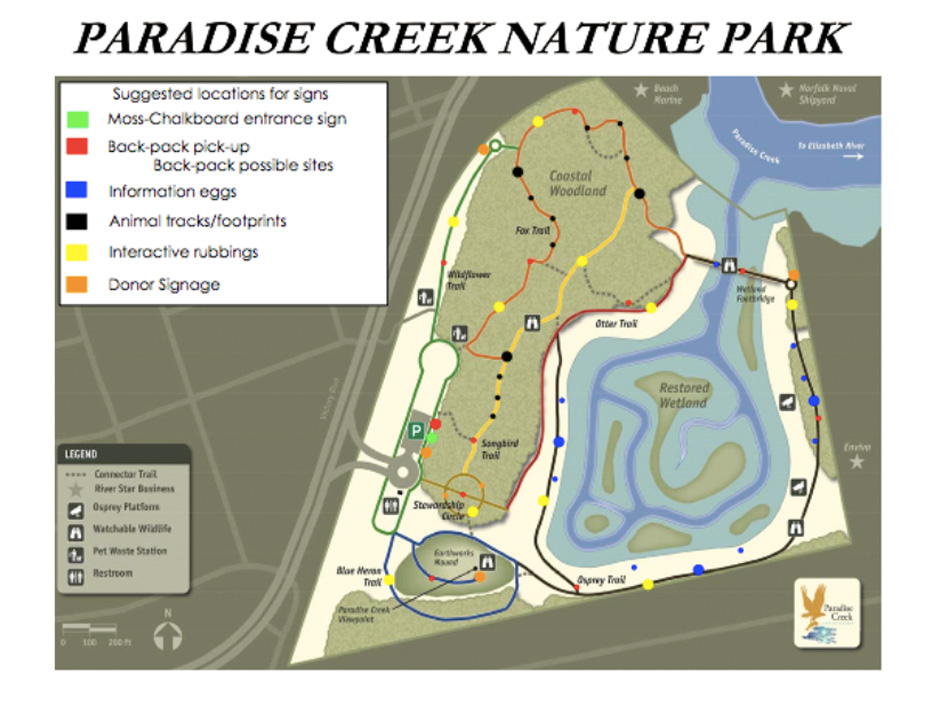
Paradise Creek Nature Park presents an interesting dynamic where the sustainable nature park is located within industrial Portsmouth, Virginia. When our team set goals we decided that we wanted to focus on interpreting signage for the park in a creative way. The park sits on just 40 acres, and we did not want to overwhelm the park with typical signs and take away from the natural beauty. PCNP undertook a unique initiative to restore this portion of the Elizabeth River into a healthy urban river and we wanted our signs to reflect this unique nature of the park. Robin Dunbar, our point of contact from PCNP expressed a desire for interactive signs targeted towards children for the park. We wanted to work with the environment, and her vision, to create signs that coincided with the curriculum being planned by other workshops. These signs would also promote the environmental stewardship programs that PCNP hopes to extend to the surrounding communities.
Schools in the area are currently in the process of integrating environmental education into their curriculum, and our community partner mentioned that many will begin to work with the park as part of this initiative. Our research also indicates that a low socioeconomic neighborhood is located directly across the street from this park. Our group felt this park could provide a real asset to the neighborhood and offer a positive outlet for the children that builds community. Thus we wanted our signs to create a stimulating atmosphere that would allow children the ability to constructively interact with the park in different ways. We felt that creating an atmosphere where visitors leave with a feeling of responsibility towards the park, and the larger environment, would help ensure that the park becomes incorporated into the community in a positive way.
As a team we decided to each individually collect examples of interesting signage from other venues to create a portfolio to present to PCNP with potential options of how to sign the park in an innovative way. Over the course of the semester PCNP invested in signage for areas of the park, which left our group confused as to how to proceed. After email correspondence with Robin (see Appendix 1), we decided to proceed with creating ideas for interactive signage while leaving content relatively undecided so that PCNP could apply the ideas where they still needed signs in the future.
Ultimately we collected fifteen different signage options from internet research, and worked to create four we thought would be best suited to the requests of PCNP and also those which would be the most feasible to implement at this time. We have explained these four options: a backpack explorer program, natural rubbing plates, interactive species signage, and an advertising campaign in detail below. We have also included our other precedent research including bright colored memory signs, textural signs, illustrated informational and directional signs, and a 3-dimensional donor sign in the following appendices. We worked in conjunction with the Family Visitor Planning workshop and the Stewardship workshop to design signage options that would flow through different aspects of the park.
In order to measure, assess, and document our work, we posted ideas we encountered on a shared Google document and included an analysis of the sign using a specific analysis template we designed for this purpose. Our method of analysis consisted of four parts. The first part was just a description of the sign or design. The second section was the method in which the sign was utilized. The third part was evaluating the appropriate target audience of each design, which could either consist of children, teens, adults, or families in general. The last part of the analysis was how the sign could be applied to the park.

